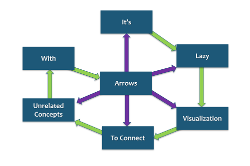
![]() At some point at every conference I attend, I see an example of one of my pet peeves of presentation visualization: the “magic arrow” slide. The presenter will be discussing a laundry list of factors related to some academic topic, like, say, effective leadership. Since showing the concepts as a bullet list might be considered boring, the presenter will instead show a visual that has 8-10 boxes containing phrases like communications, vision, mentoring, and accountability. And inexplicably there will be arrows connecting all the various boxes.
At some point at every conference I attend, I see an example of one of my pet peeves of presentation visualization: the “magic arrow” slide. The presenter will be discussing a laundry list of factors related to some academic topic, like, say, effective leadership. Since showing the concepts as a bullet list might be considered boring, the presenter will instead show a visual that has 8-10 boxes containing phrases like communications, vision, mentoring, and accountability. And inexplicably there will be arrows connecting all the various boxes.
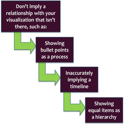
Easy PowerPoint formatting enables these types of problems. Presenters don’t want to spend the time thinking through the logic of their information and so they format random concepts using a process flow image. Or they will imply a timeline or hierarchy that isn’t there. At a glance it might look nice, but it doesn’t support any depth of analysis.
 Today we are inundated with data, so it is critical that we all understand how visualization plays a role in understanding complex information. Effective visualization can illuminate insights and drive informed decision making. But lazy data visualization and presentation, where the author cuts corners rather than investing the time to create something meaningful, can lead to loss of clarity, misinterpretation, underutilization, and confusion.
Strategies to Avoid Common Pitfalls
There are a few tips to avoid falling into the trap of lazy data visualization and presentation:
Skills Development
Building expertise in data visualization tools and techniques pays off in the long run. Take the time to learn best practices, experiment with different approaches, and refine your skills to create compelling visuals that resonate with your audience. If you lack these types of skills, make sure someone on your team has them.
Learn the Logic of Storytelling
Before creating any visualization, take the time to thoroughly understand the data and the story it tells. What is the intention and obstacle? How are we connecting dots? Consider the context, audience, and objectives to ensure that your visualizations effectively communicate the intended message without bias or distortion.
Collaborate
Solicit feedback from colleagues, peers, or domain experts to ensure that your visualizations are clear, accurate, and impactful. Constructive criticism can help identify blind spots and areas for improvement, leading to stronger visualizations.
Conclusion
Lazy data visualization and presentation is a tempting but risky practice. By investing time, effort, and skill into crafting meaningful visuals, you can unlock the full potential of our data and drive better decision-making. Or at least avoid being mocked at your next conference presentation.
To learn more about data visualization and performance reporting check out our KPI Professional Certification..

David Wilsey is the Chief Executive Officer with the Balanced Scorecard Institute and co-author of The Institute Way: Simplify Strategic Planning and Management with the Balanced Scorecard.